MR Direct Website
Improving and enhancing the experience of an established ecommerce platform.
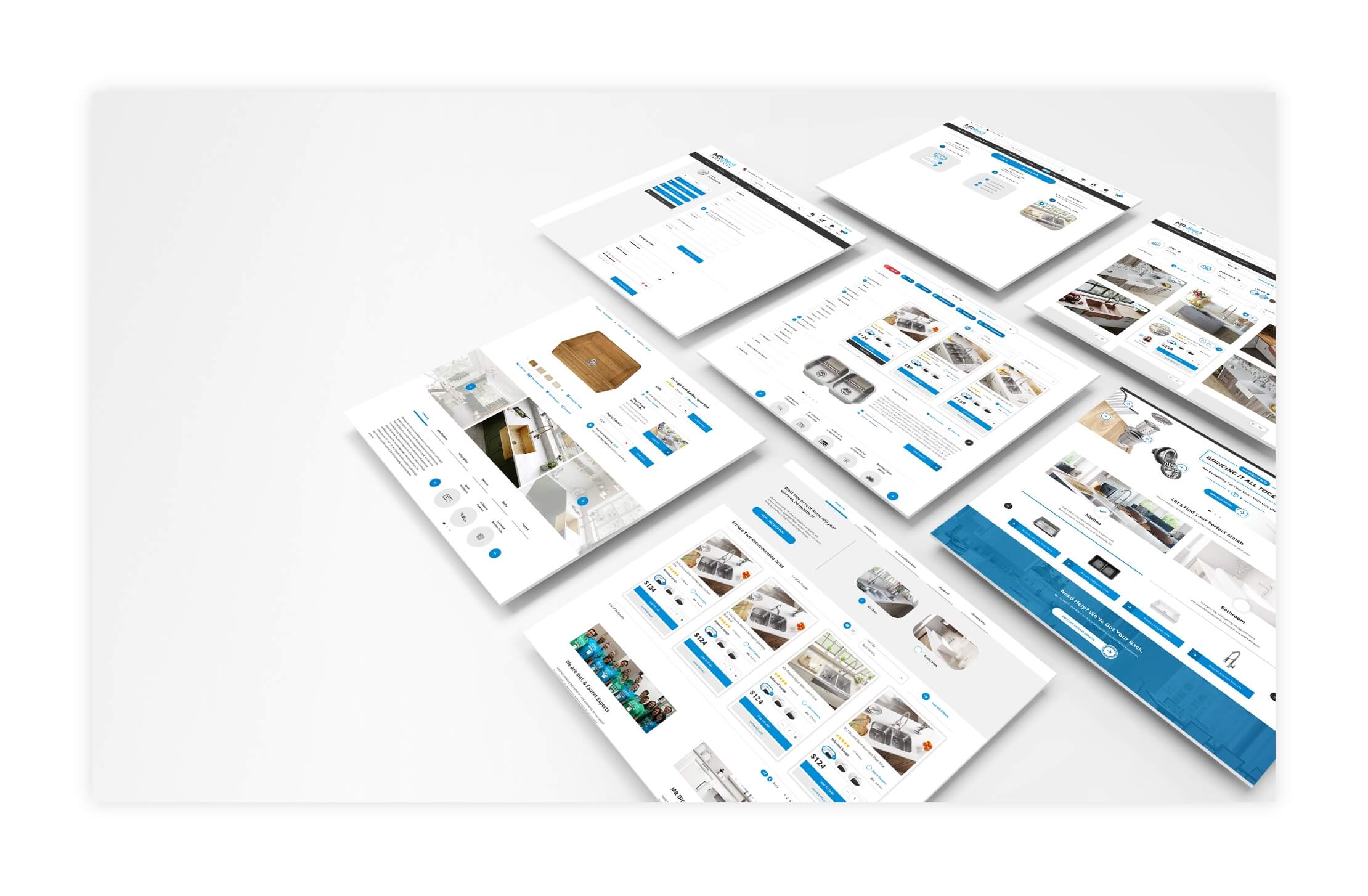
When I joined the team at MR Direct, I was tasked with assessing the overall experience and performance of our website platform. The scope of this project was massive effort. Basically, every component, design element, and piece of functionality across the site warranted some level of attention.
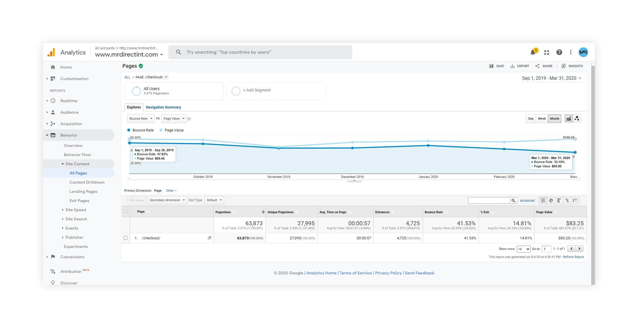
I started by digging into the analytics data that we were capturing. I identified a few key areas that were under-performing and, if addressed, would potentially have the greatest impact on the overall experience. These highly-trafficked areas of the site were the "holes in the ship"; measuring poorly in vital metrics like bounce rate, exit percentage, session quality, and conversion rate.
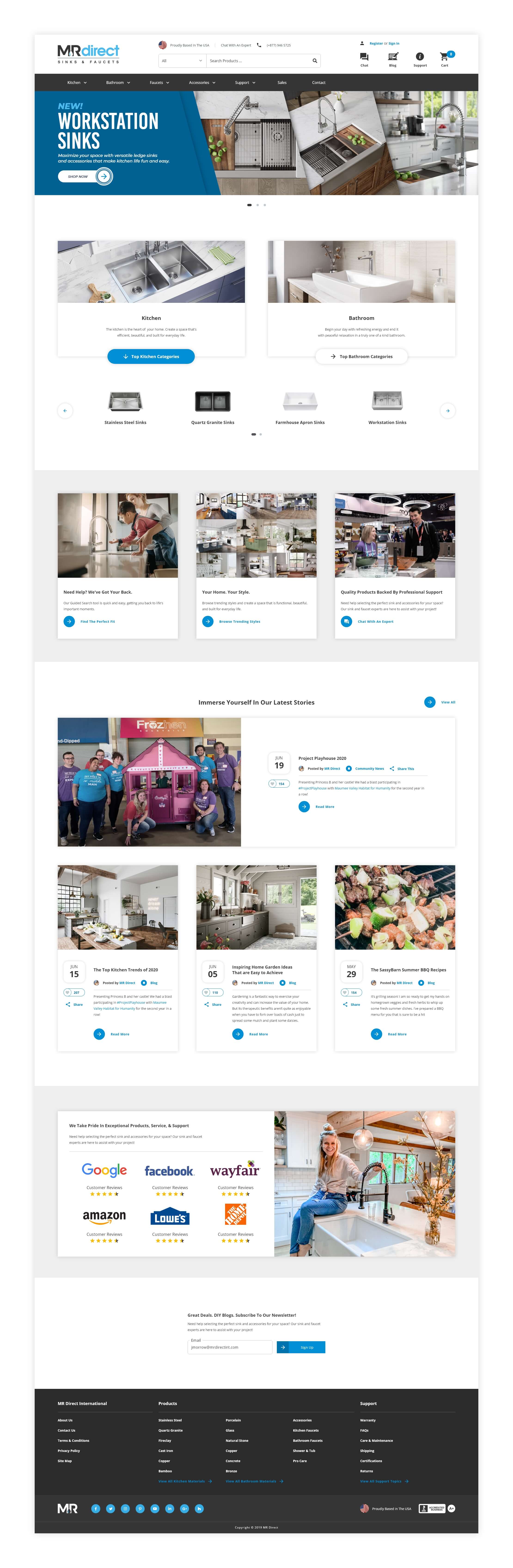
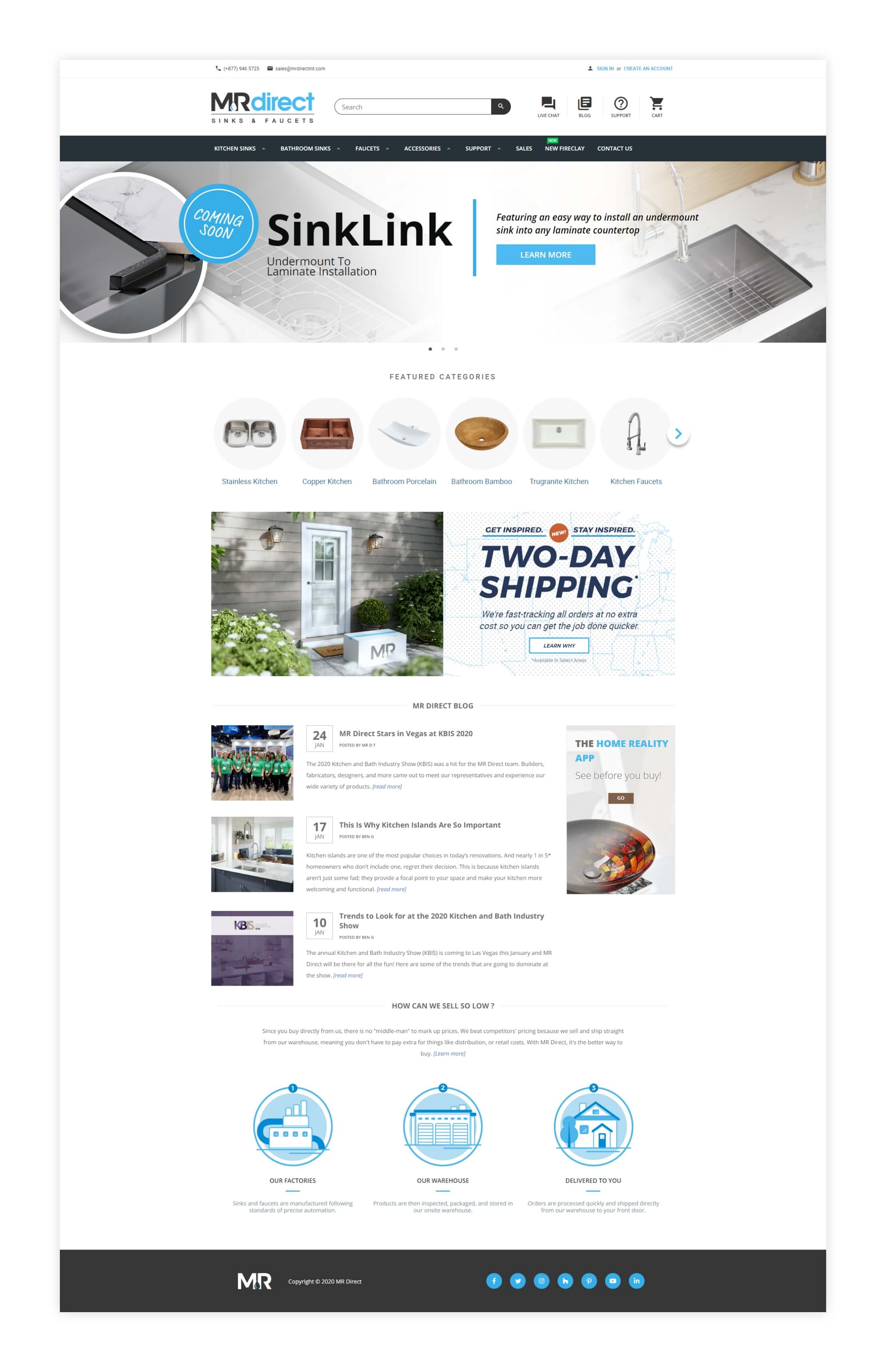
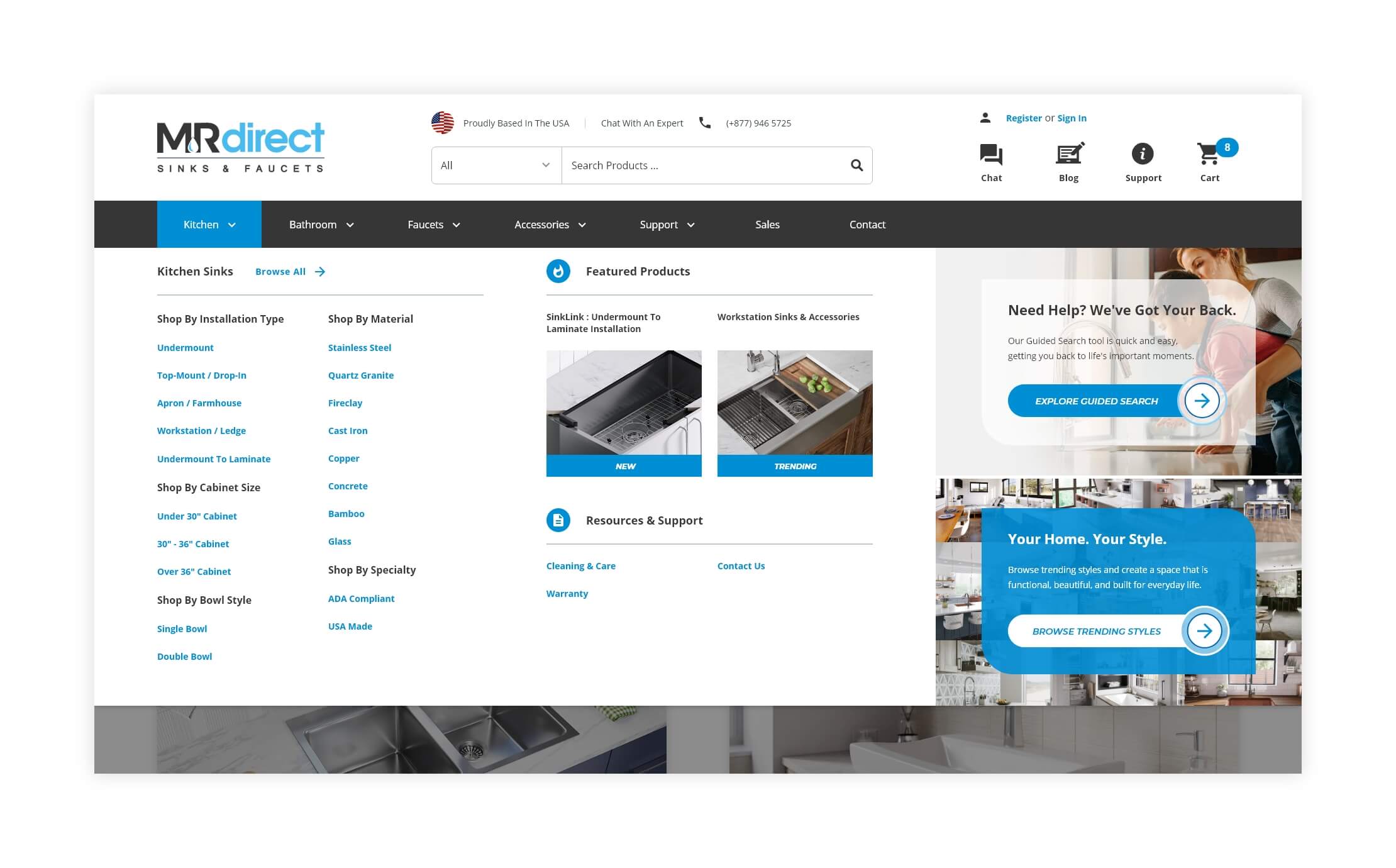
Homepage : About a third of the overall traffic to the website, including 55% of our hard-earned organic traffic, was being funneled through the homepage. Surprisingly, 66% of those total sessions resulted in a bounce. I sampled data from over 1.5 million total sessions and 994,000 of those resulted in a drop-off at the homepage. This meant that, for some reason, our homepage content was not resonating with about 2/3 of the users that viewed it.
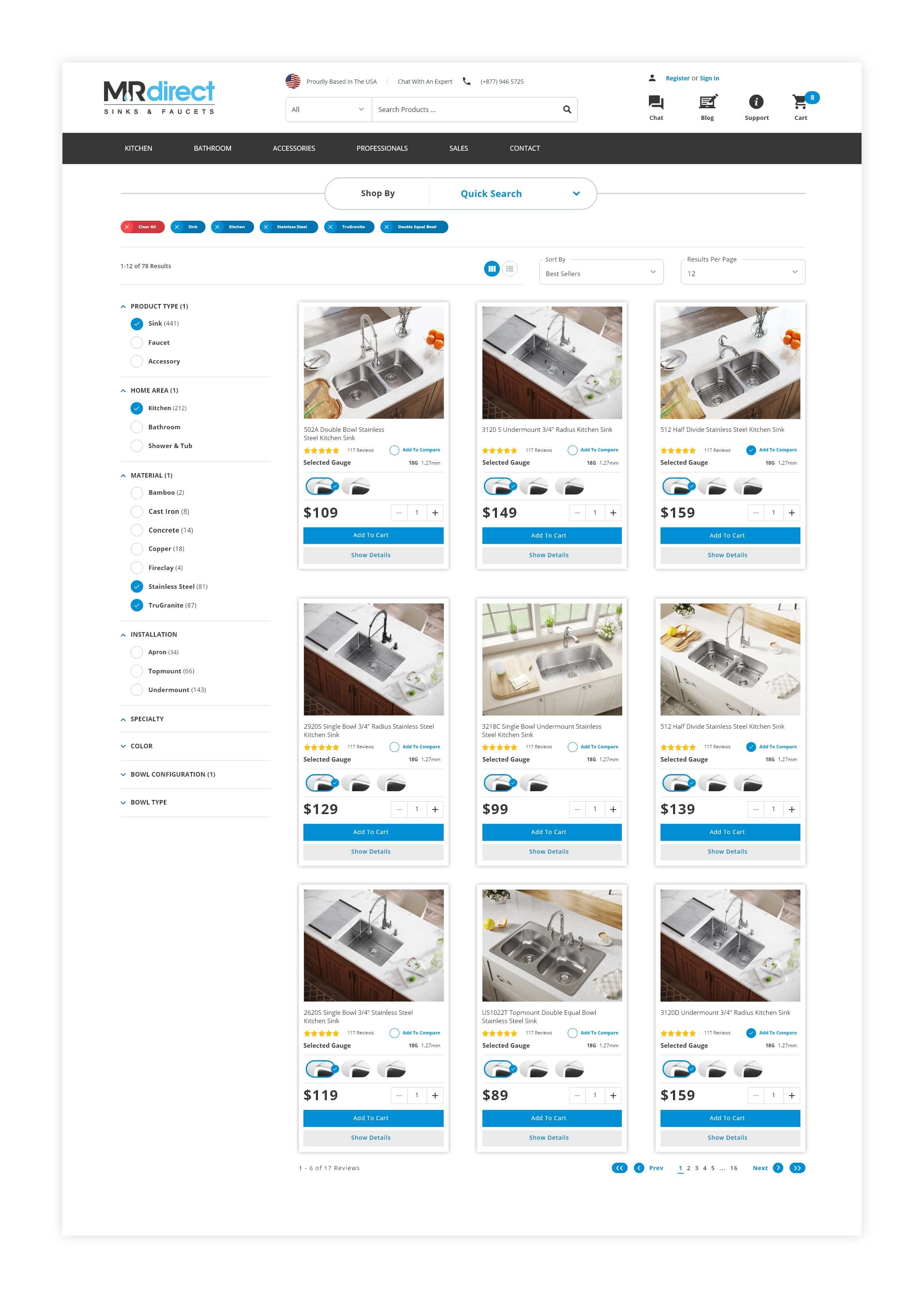
Product Listing Page : 78% of our traffic from paid search and social were being driven to our product listing page. This content is a vital component of the overall search experience serving as highly-trafficked entry point from external search and secondary interaction point during the internal search process. A staggering 61% of the total traffic that funneled through our product listing page resulted in a bounce. This meant that either the product listing page experience itself is not intuitive or the site search functionality isn't returning relevant results within the product listing page view, both of which could potentially lead to frustration and/or confusion for the user.
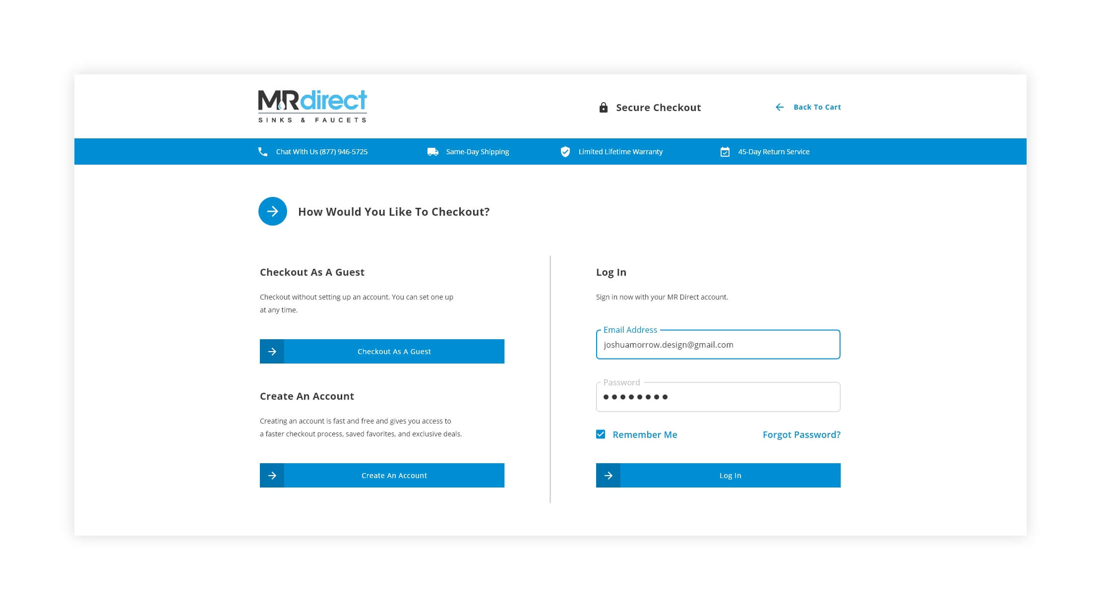
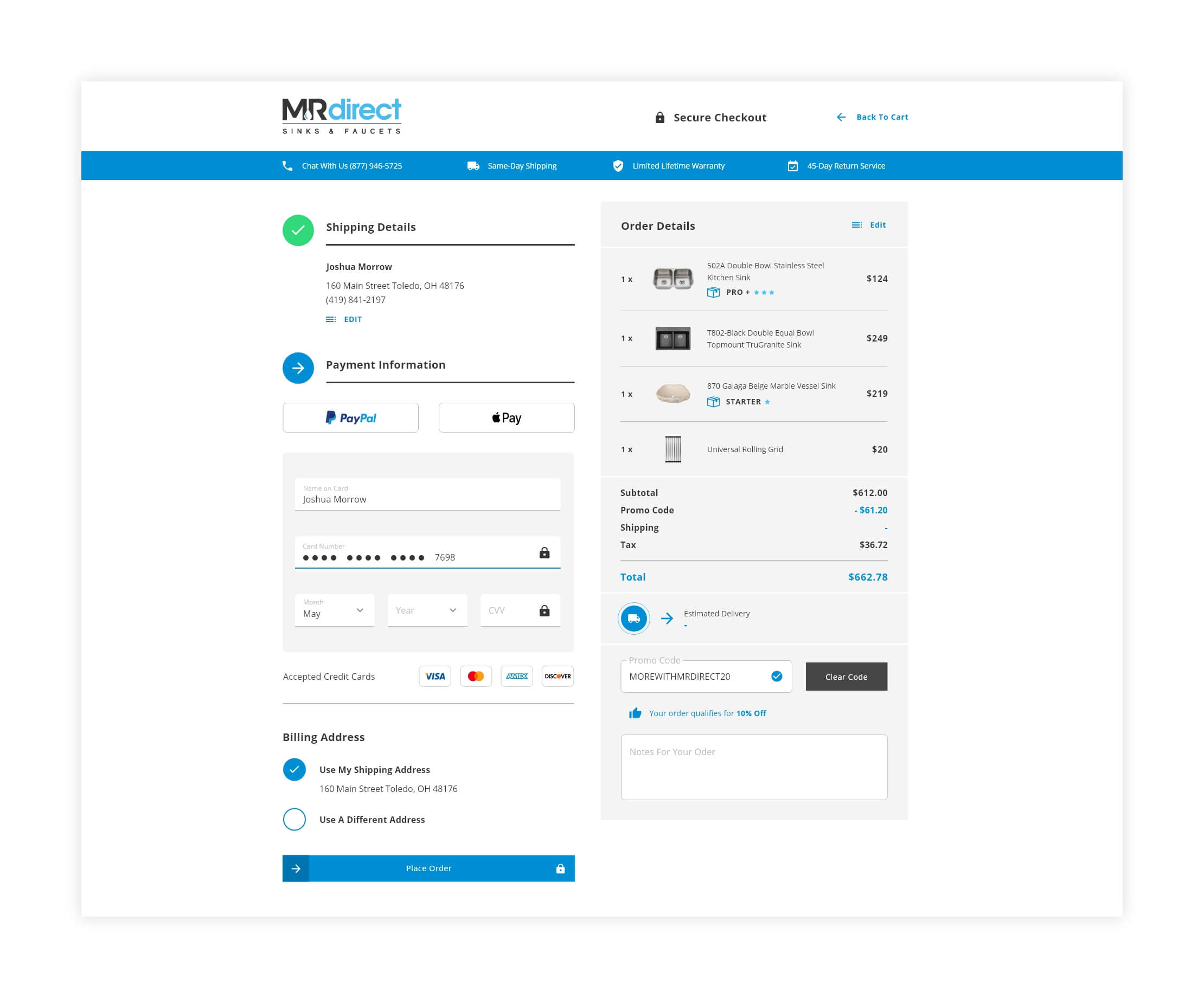
Checkout : The checkout process was confusing, clunky, and in some instances, even functionally broken, which was a huge red flag. These issues we plaguing the overall checkout experience which had an exit percentage of nearly 48% and a conversion rate of 1.89%. The checkout process needed to feel familiar and intuitive to the user in order to build confidence and trust in their purchasing decision.
Goals, Strategy, & Execution
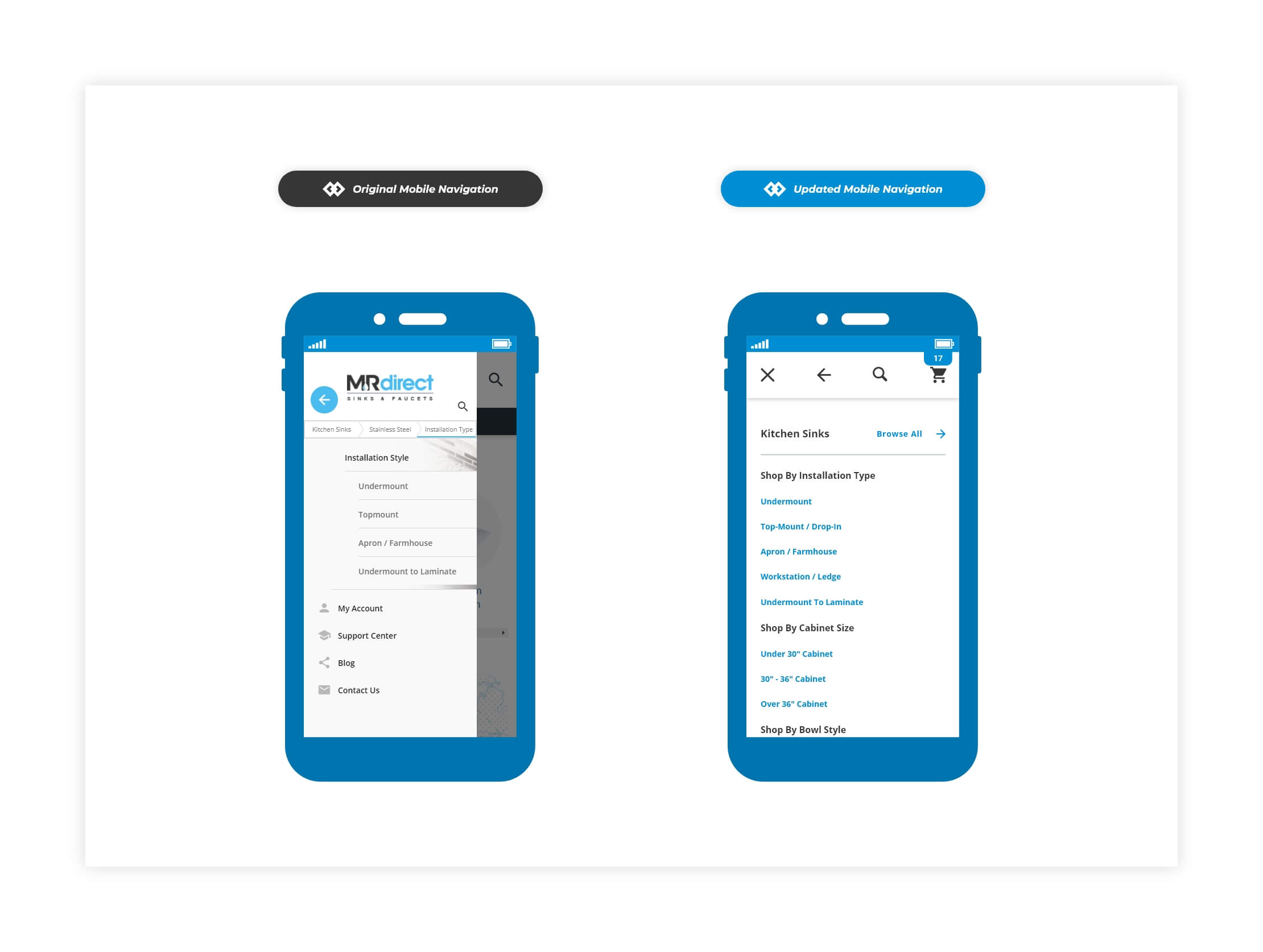
I leveraged research, observations, and competitor analysis to develop clear goals and strategy to improve the website experience. The foundation element that underpinned the entire effort was developing a cohesive experience across the entire site. I achieved this by developing a robust design system and then consistently and deliberately adhering that common visual design language when building components and functionality.
Throughout the process, I utilized an agile development methodology to quickly adapt, iterate, and distill complex ideas down to core principals and components. I established relationships, asked questions, and facilitated the process of cultivating executable deliverables from discussions within our cross-functional teams.
Developing and maintaining a design system was a huge asset to our design and development teams. Having a single source of truth allowed our teams to design, realize, and develop with purpose, confidence, consistency, and speed. Most importantly, we developed a framework that could scale and constantly evolve with the introduction of new ideas, tools, and technologies.
We learned so much about our brand during the discovery process. We were finally able to define "who we were" and "what we were aiming to accomplish". I think this aspect of the entire experience was the most challenging and interesting for me, personally.
The shared values and principals that our design system provided allowed us to improve the key focus areas of our website experience. The end result was exceptional growth in key metrics. Our homepage bounce rate improved from 66% to 35%. Our checkout conversion rate increased from 1.89% to 2.35%. The average session duration and average session quality across the site improved. We saw record revenue, performance milestones, and built momentum to continue to adapt, evolve, and improve our ecommerce experience.